Animated Loading Button In Flutter
How to Create a Custom Animated Loading Button in Flutter
In this tutorial, we’ll build a custom animated loading button in Flutter — perfect for handling async actions like login, form submission, or any network-related interaction. The button will animate between its normal and loading states with a smooth UI transition.
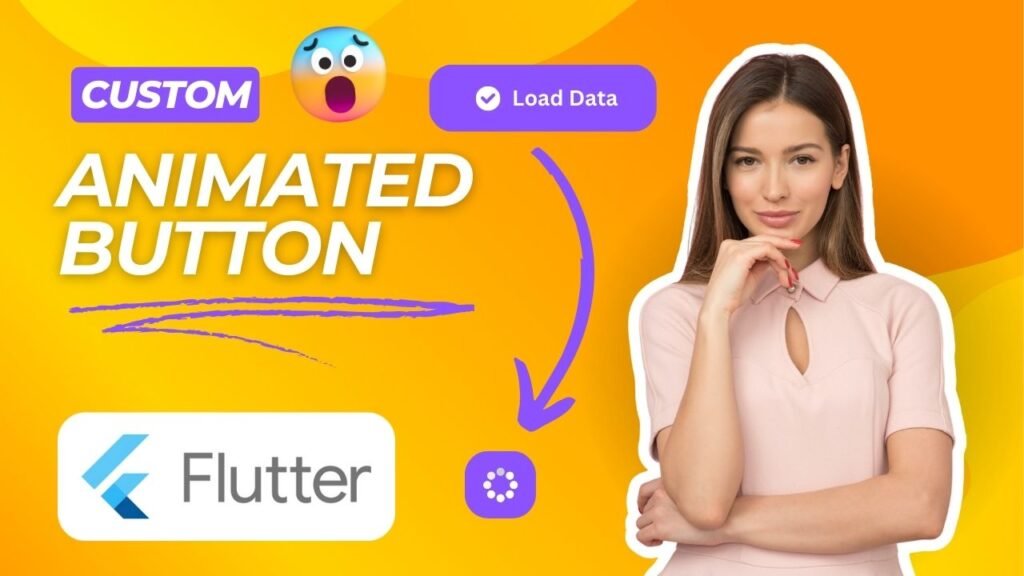
🚀 Final Output Preview
Watch the full implementation in this YouTube tutorial:
📦 Dependencies Used
Add these to your pubspec.yaml:
dependencies:
  flutter:
    sdk: flutter
  cupertino_icons: ^1.0.8
  fluentui_system_icons: ^1.1.260
  loading_animation_widget: ^1.3.0
  google_fonts: ^6.2.1
🎨 Step 1: Create a Constants File
In Constants.dart, define your color palette:
const Color bluePurpleColor = Color(0xff5D5FEF);
const Color primaryColor = bluePurpleColor;
Color greyFont = const Color(0xff737791);
Color greenColor = const Color(0xff00E096);
// ... other colors ...
const Color backgroundColor = Color(0xffFAFBFC);
const Color headingColor = Color(0xff151D48);
🛠️ Step 2: CustomLoadingButton Widget (Full Code)
This reusable widget handles the animation and loading logic:
class _CustomLoadingButtonState extends State {
  bool isLoading = false;
  bool showText = true;

  @override
  Widget build(BuildContext context) {
    return InkWell(
      onTap: () async {
        setState(() {
          isLoading = true;
          showText = false;
        });
        await widget.onTap();
        setState(() => isLoading = false);
        Future.delayed(Duration(milliseconds: 100)).then((_) {
          setState(() => showText = true);
        });
      },
      child: AnimatedContainer(
        width: isLoading ? 60 : widget.width,
        height: widget.height,
        duration: Duration(milliseconds: 200),
        decoration: BoxDecoration(
          borderRadius: BorderRadius.circular(15),
          boxShadow: [
            BoxShadow(
              color: widget.isBorderButton
                  ? Colors.white
                  : primaryColor.withAlpha(50),
              blurRadius: 10,
              offset: Offset(0, 10),
            ),
          ],
          border: widget.isBorderButton
              ? Border.all(color: primaryColor)
              : null,
          color: widget.isBorderButton ? Colors.white : primaryColor,
        ),
        child: isLoading
            ? LoadingAnimationWidget.threeArchedCircle(
                color: widget.isBorderButton
                    ? primaryColor
                    : Colors.white,
                size: 35,
              )
            : Row(
                mainAxisAlignment: MainAxisAlignment.center,
                children: [
                  if (widget.icon != null)
                    Icon(
                      widget.icon,
                      color: widget.isBorderButton
                          ? primaryColor
                          : Colors.white,
                    ),
                  if (widget.icon != null) SizedBox(width: 8),
                  if (showText)
                    Text(
                      widget.title,
                      style: GoogleFonts.poppins(
                        fontWeight: FontWeight.w600,
                        color: widget.isBorderButton
                            ? primaryColor
                            : Colors.white,
                      ),
                    ),
                ],
              ),
      ),
    );
  }
}
Make sure to include this inside the CustomLoadingButton widget from the previous step.
🧪 Step 3: Using the Button
In HomeScreen.dart, simply use the widget like this:
class HomeScreen extends StatelessWidget {
  const HomeScreen({super.key});

  @override
  Widget build(BuildContext context) {
    return Scaffold(
      body: SafeArea(
        child: Center(
          child: CustomLoadingButton(
            isBorderButton: true,
            title: 'Click Me',
            icon: FluentIcons.checkmark_circle_20_regular,
            onTap: () async {
              await Future.delayed(Duration(seconds: 1));
            },
          ),
        ),
      ),
    );
  }
}
✅ Features
-
Animated transition between text and loader
-
Optional border style
-
Optional leading icon
- Reusable and customizable
📁 Folder Structure (Simplified)
lib/
│
├── Constants.dart
├── Widgets/
│ └── CustomLoadingButton.dart
└── HomeScreen.dart
🎉 Conclusion
You now have a fully customizable animated loading button in Flutter! This UI pattern is a fantastic way to improve the user experience for async actions.